Butts Happen

Tuesday, May 26, 2009

ghostintheshell

Okay I admit I'm using these tutorials for another class, but it's still digital!! Still counts, right? yes indeed, images are links.


I don't think I like this one much. I don't like the end result, and there's too much preceding crap that I already know. I'm sure there's stuff in there I could use, but it's too hard to dig through the baby steps.


This one's a little better. More easily read, more tricky, more overall useful. But I still don't want to use that method, I was looking for which brush setting is good to use. :(


Am I just overly picky? I don't like this one at all -- this is just the basics, and the final result isn't all that nice at all.

Okay, then I sort of gave up on inking at all for a second.

Speed painting! Whenever I try it it comes out looking a bit like crap, but this tutorial wasn't very useful. That's the basic idea, and I didn't learn much.

Alright and then I just got distracted all together.

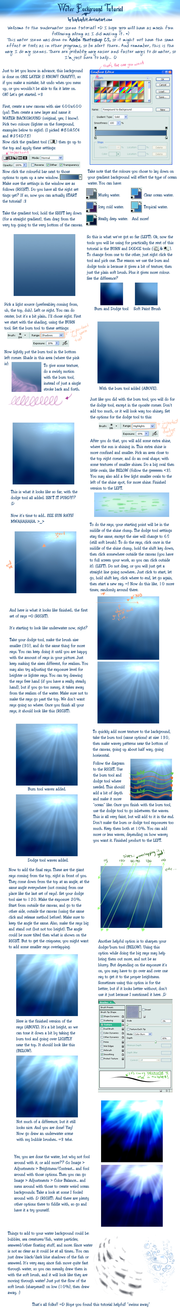
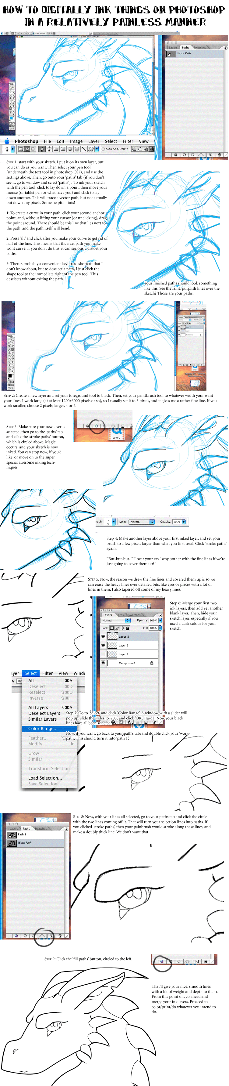
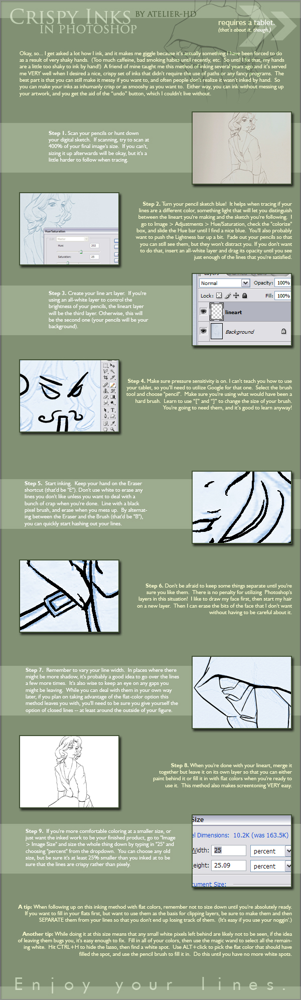
I REALLY like this tutorial. It's not Photoshop tricks that I'm learning as much as how to apply them -- and I think that's really really useful. I'm definitely going to be keeping that one bookmarked.


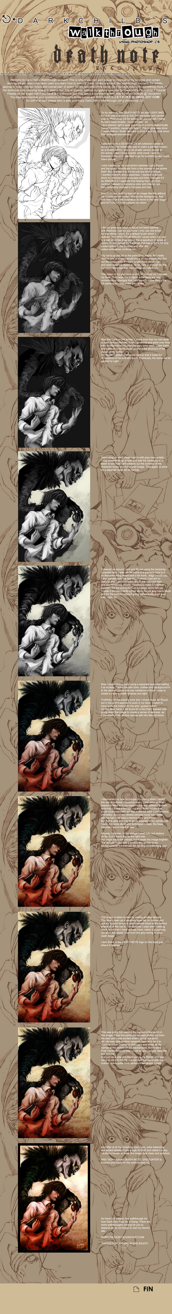
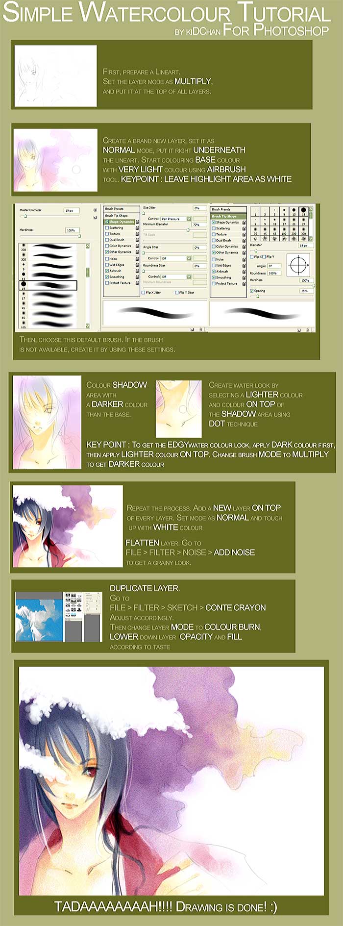
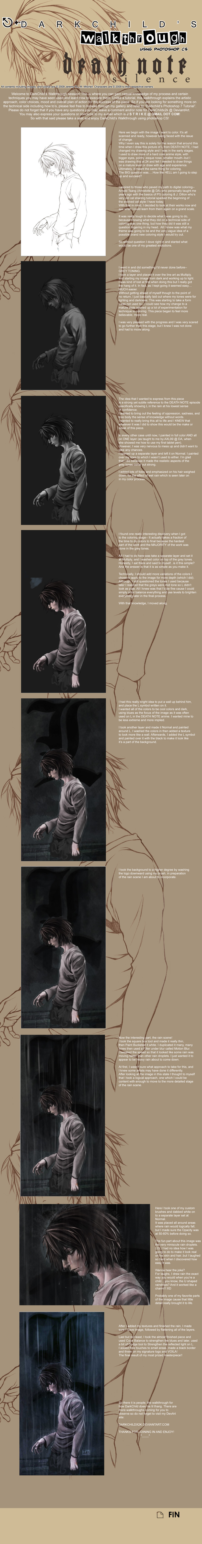
And then I realized this guy had more tutorials! And I rejoiced. And I bookmarked a few more things. I like the final picture a little less in this one, but again, it's useful information.

Then suddenly I was more interested in the rain effect than inking.

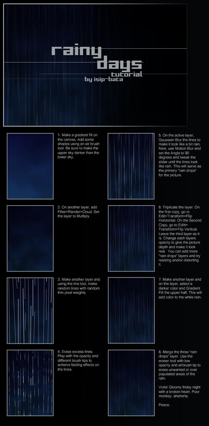
This one's pretty useful too! Everyone seems to have a slightly different method for making rain.


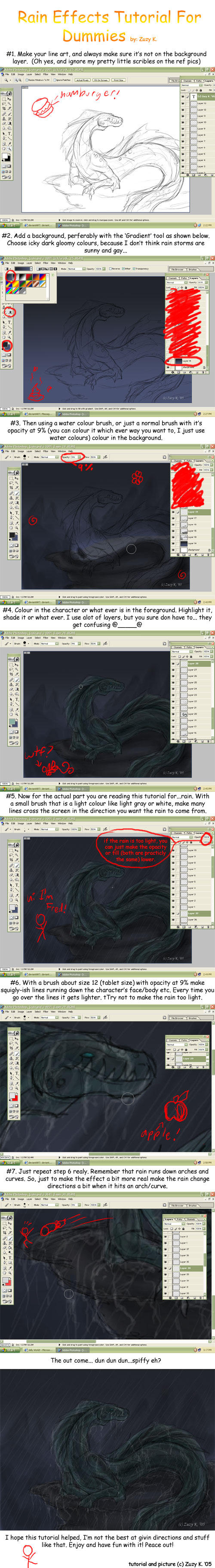
This one was less helpful in the actual raindrops bit (but I can use the other tutorials for that), but pretty good about rain-on-objects. I can learn from that, too!


Some people have really weird methods.


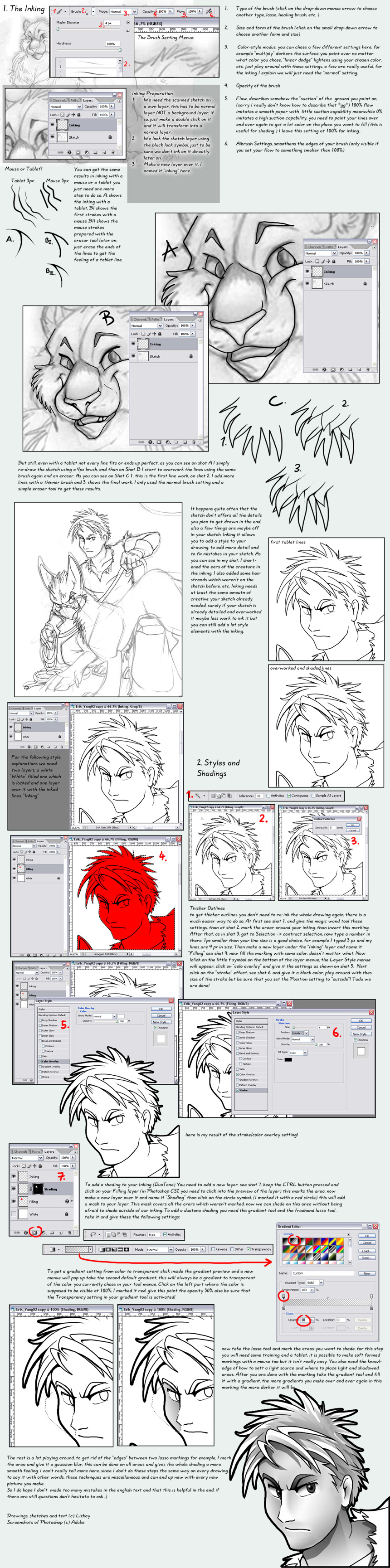
I think this person was actually using a mouse rather than a tablet. So her pointers are more on how to make it look good-despite-mouseage. Not much use to me, then.


WELL, I guess I'll just go with my usual method then, since I don't really feel like learning the pen tool right now.

Thursday, May 21, 2009

that burger looks pretty good

That tutorial, by Messa, where I was all impressed about the blur effect? I'm definitely trying to imitate her coloring methods, but it's taking some time. In the meanwhile, I imitated just the blur. With interesting results.

Original:


With blur!:


It was fun.

Tuesday, May 19, 2009

testosterone-infused machismo

This has always been one of my favorite tutorials. (Sorry for not uploading it directly, but it's a PDF and that's the best solution I could think of.) It's great not just for technique, but for the idea process as well. I think it's incredibly useful, even if the end result of it isn't exactly the end result you're looking to duplicate.


For the rest: click to enlarge.

This one seems pretty useful. It seems pretty simple, and I'm sure there are a thousand other ways I could achieve the same thing, but it was still interesting to read over.


This one is good if you're looking for that effect, but I have to say I would probably prefer to just use watercolor to get a watercolor effect. I like the bit about the layer modes though, that's pretty useful. Playing around with layer modes is what makes Photoshop so amusing for me.


This one is another pretty useful one if that's what you're looking for. I can't think of that many times I need to draw an animal eye, but it will happen one day! And on that day, I'll be glad to have this tutorial.


I wasn't too impressed with this tutorial at first, because it wasn't really anything I didn't know. But then the artist got to the bit about creating a duplicate and blurring it, and I was suddenly amazed. I'd always wondered how people did that...


This tutorial is creepy. I'm not sure I really want to paint like that.

Logo Process


First I started out with the basic colors and shapes. Blue rectangle on a white rectangle on a black background. A good start!


Next I matched the font as best I could -- it's not exact, but it's close, and added the yellow rectangle as an underline.


Then came the fun part. I had to start tracing the Michelin Man, because there was definitely no other way I could think of to reproduce an image like that.


When I was done tracing I had to select the shape under the image I'd just created to fill it with white. I moved it to a different color of a background to make it easier to see if I'd gone over the line.
Additionally I selected the outermost object, the outline, and thickened it to 2 px to make it more bold.


Lined him up to make sure the proportions were right...


Then put it all together!