Logo Process
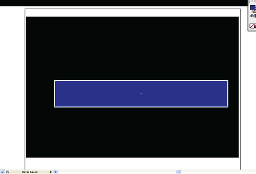
First I started out with the basic colors and shapes. Blue rectangle on a white rectangle on a black background. A good start!
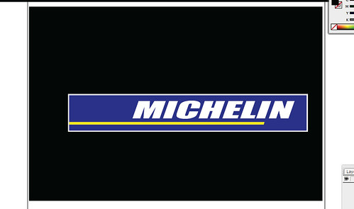
Next I matched the font as best I could -- it's not exact, but it's close, and added the yellow rectangle as an underline.
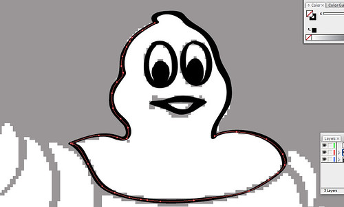
Then came the fun part. I had to start tracing the Michelin Man, because there was definitely no other way I could think of to reproduce an image like that.
When I was done tracing I had to select the shape under the image I'd just created to fill it with white. I moved it to a different color of a background to make it easier to see if I'd gone over the line.
Additionally I selected the outermost object, the outline, and thickened it to 2 px to make it more bold.
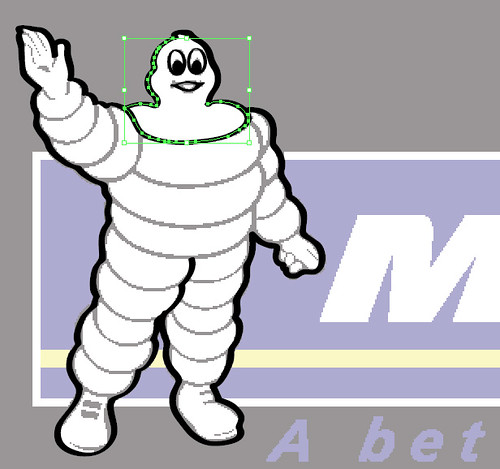
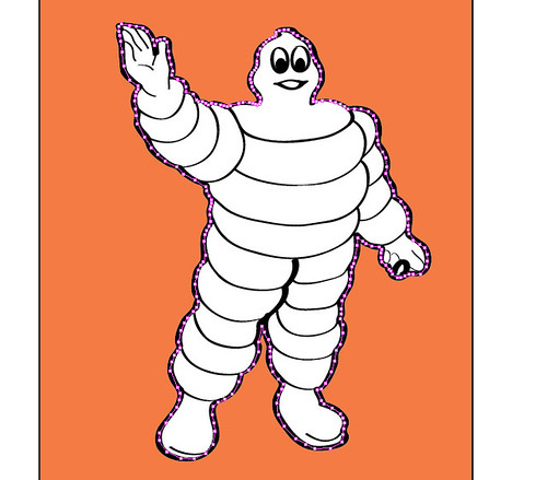
Lined him up to make sure the proportions were right...
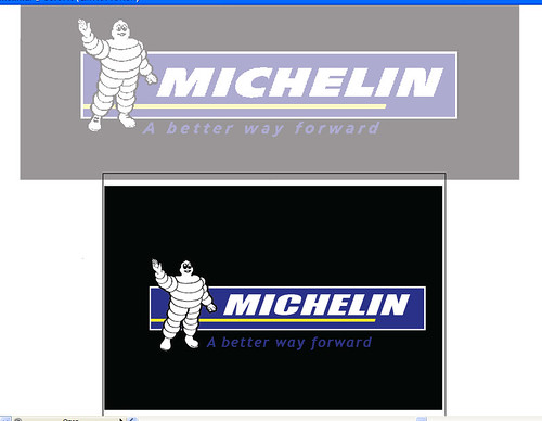
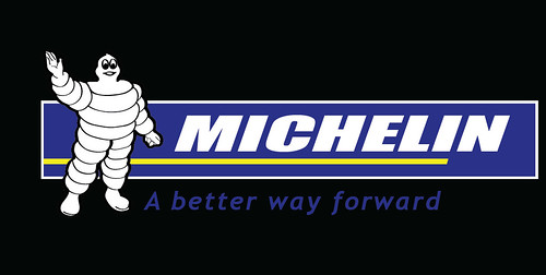
Then put it all together!
posted by Liz @ 10:39 AM
![]()

0 Comments:
Post a Comment
Subscribe to Post Comments [Atom]
<< Home