Butts Happen

Tuesday, April 21, 2009

you have just got to be ultra-paranoid


Attempt two! It turned out to be too frustrating to trace the leaves, so I went with something all new. I didn't see much Saggyman art that invoved vectorized nature anyway. I like this more than the first.


Abstract Background Tutorial.
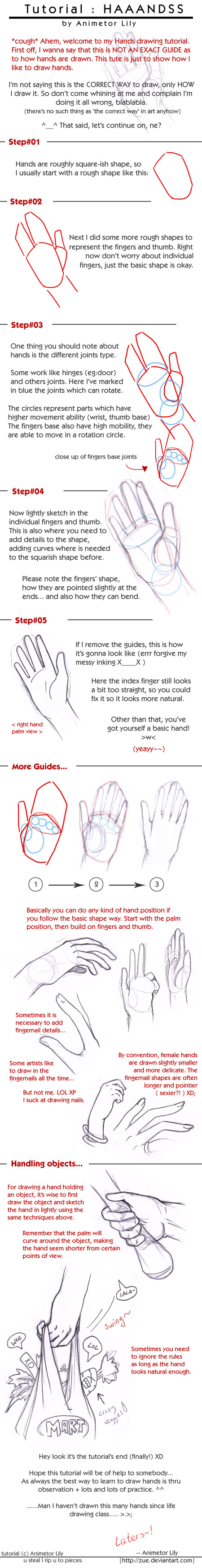
I like this one. It's all pretty self-explanatory, but it's really nice to have it confirmed for me that that IS, in fact, how Illustrator works, I'm not just guessing and fumbling through the dark.
I don't really like the final design, though.

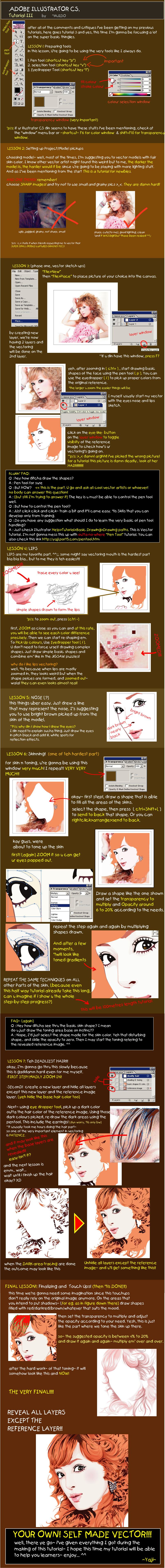
Tracing Photos Tutorials.
This is really really one to keep an eye on, and I wish I'd found it sooner! This is exactly what I was trying and failing to do just last night. I have to try this one when I get home, seriously.

Comic Style Strokes Tutorial.
This one seems a little too washed-down and simple. It works, but it doesn't look very good. It seems to me that the same effect would happen in Photoshop, only it would look better.

Creating a Logo.
I think this one's going to come in really useful for the next project! I have to keep track of this tutorial as well. (I actually like the end result as well, so that's a plus.)


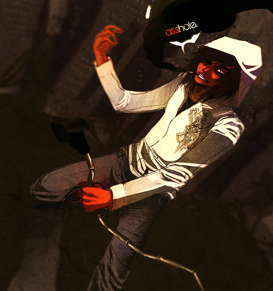
This... is so cool. I'm going to watch it every night before I go to bed until I figure out exactly how to do it.

Wednesday, April 15, 2009

give judy my notice

Most of this project seemed to involve sitting around and thinking. I saw that Stefan Sagmeister's art seemed to involve a lot of written messages, and the ones that interested me the most were those that used nature as a canvas. So I took note of potential messages as well as general elements of his art. All of his messages seemed to be positive ones, which gave me the idea of using a hand in the 'thumbs up' position and writing on it. This was my main idea for a while.


This was the picture I wanted to use:
I'd had it worked out in my notes, "everybody" would go on the thumb, "who is" on the first finger, then "honest", "is", "interesting", and probably "Stefan Sagmeister" on the wrist.

Then, though, I stumbled on this picture...

And remembered having seen it earlier. It had stuck with me. The act of vandalizing nature to get across a positive message captured my attention very successfully. I wanted to try something similar.

After a quick survey of my house, I found an old brown leaf I'd been hoarding since fall, a thick marker, and some dried roses my mom gathers from the garden. I had all the supplies I needed, and I knew which message would be short enough not to be difficult to read.


I wrote it on one side of the leaf at first, but it looked lumpy and gross. The composition seemed a little stupid too. But it was just the first try.


I figured out the lighting I wanted to use next. (Done by just removing the flash and turning on the track lighting overhead.) Still didn't like the arrangement, though.


Flipped the leaf over and tried again, and this time was happier with the layout of the writing. The composition is a little better, too.


Added some more stuff, alright! But the angle was a little too straight foward.


And then I was done!


Attempt two in Illustrator coming soon.

Thursday, April 9, 2009

who the heck are these jerks

Stefan Sagmeister


I really admire his use of text, and I'm staring to see a theme in my appreciates of that. Text over images, text supplementing images but not explaining them, unusual and not typically straightforward choice of words (high-contrast photographs or illustrations).

I don't have any ideas for my imitation of his art yet, but I can't wait to start working on it.


The first thing I've finished in a week or two, I like how this came out. I'm always attracted to drawing this particular character's sly eyes/knowing smile, now I've gotten it out of my system for a while.


This was my favorite of the font patterns we did; cursive Ls bring me pleasure in general, but apparently they're pretty awesome when you shove them all really close together. I think I would actually use this pattern in another piece of work.
I liked working with Illustrator, too. More than I thought I would. I liked most that each type didn't become a new layer, that drives me crazy in Photoshop. The vectors were great, moving and resizing was convenient. It's convinced me that it'd be worth it to learn more about it!


Second favorite! Uppercase J in Stencil.


Why, yes, I do pretty much stalk Sophia. (This one's a cover page for an installment of her webcomic.) I love the grunge of this one -- that's a theme in her work, but this one carries it particularly well. And the cropping is just eerie.


Strange Dream, by Seto.

Tuesday, April 7, 2009

we can all wear sars masks and justin will cry blood


(all images: click to enlarge)
This is my friend Sophia's art, and I just have to say, I'm going to kill her one day. She's not even out of high school, nor does she want to pursue art as a career. I just. What.


She does a lot with text in her art, I think it's really impressive. I met her about two years ago and she was moderately good, and since then she's developed this amazing style and her techniques have just shot up and basically I'm pretty sure she sold her soul.


This one is by fresh4u, another impressive piece. I really admire people that can create an atmosphere like that. The lines are simple, they're even messy, but the effect they create all together brings me glee.


(click to enlarge)
A tutorial by scruffyronin.
I like the organization of this tutorial, it allows itself to be understood without actually reading anything. Not that you shouldn't read it, but you know. It's a good trait. My favorite tutorials are the sort that point out something you could have figured out if you'd stared hard enough, but that you don't necessarily think about. These are the kind you can just quietly keep in the back of your mind and incorporate when you next draw.
In short, I liked this one. Not the most insightful thing, but simple and useful.


(click to enlarge) (the picture in question)
Another one by Sophia. I really really liked this tutorial. Some of her techniques I ended up not liking very much, but some of them I found just about invaluable. She always seems like a Photoshop wizard to me, uncovering amazing new features and figuring out how to best implement them. I've been inspired by her discoveries a few times to make some of my own, but like the leech I am, most things I know I learned from Sophia.


(click to enlarge)
This one's by yajido. I admit I haven't had much of a chance to put this one to use, but I really want to. I haven't had much experience with vectors and this looks perfect for teaching that!


Hand tutorial by zue.
This one seemed less useful. I didn't learn anything new, although the bit about circles and joints could be put to use. I think the artist could have explained a little more and given a few more tips, possibly about musculature structure and the way the skin folds.


Animal tutorial by Cedarseed.
This seems almost not at all like a tutorial. Each animal should probably have its own guide, otherwise I'm better off just looking up photographs of these animals myself.


Definitely wanna go back and check out the vector tutorial.